Using Shortcodes
One of the biggest reasons we use Markdown to write content on the website is because it helps really separate the content you’re writing from the layout that displays it, which helps you focus on writing content and writing it well. Sometimes, though, you need just a little bit of control over how your content is being displayed. That’s where shortcodes come in.
What are shortcodes?
I already know what they are, show me the ones I can use.
If you aren’t familiar with what shortcodes are or how they work, they are simple tags that you write into your content that represent a piece of layout—a box, a button, etc. When WordPress converts your Markdown content into HTML, it detects these shortcode tags, processes them and turns them into specifically formatted code.
Take the following shortcode for example:
[box color="red"]
This text is in a box.
[/box]
When rendered, this might produce something like:
This text is in a box.
Available shortcodes
The New Orleans theme provides a few useful shortcodes for you to use:
Buttons — [btn]
Creates links that are styled as buttons, allowing you to emphasize specific calls to action in your content.
Example
[btn color="success" href="http://google.com"]Click Here[/btn]
(Screenshot taken from site)
Attributes
| Name | Default | Description |
|---|---|---|
| href | — | Required. The URL the button should link to. |
| color | default |
The button color. You can choose any available theme color (see below). |
| outline | false |
Styles the button in reverse—uses a transparent background and uses the supplied color for the border and text. |
| size | — | Adjusts the size of the button. Possible choices are xs, sm and lg. Omit this option to use the default size. |
Color options
| Color Name | Example |
|---|---|
| default | Color Sample |
| success | Color Sample |
| info | Color Sample |
| warning | Color Sample |
| danger | Color Sample |
| purple | Color Sample |
| green | Color Sample |
| gold | Color Sample |
| teal | Color Sample |
| pink | Color Sample |
Grid display — [row] and [col]
The row and column shortcodes allow you to create a system of grid-style containers and display content in them. The width of the page is split into 12 single columns; the total width of all the columns in a row should be less than or equal to 12.
Example
[row]
[col width="8"]
This container is _eight_ columns wide. Lorem ipsum dolor sit amet,
consectetur adipiscing elit. Suspendisse pharetra mauris eu diam
pulvinar, bibendum scelerisque lorem mattis. Nunc fringilla tellus
eu nisi elementum iaculis. Mauris pulvinar risus justo, ac maximus
libero convallis a. Aliquam enim ex, faucibus quis dui tempor,
consequat scelerisque neque.
[/col]
[col width="4"]
This container is _four_ columns wide. Lorem ipsum dolor sit amet,
consectetur adipiscing elit. Vestibulum vitae vulputate ipsum.
Sed lectus augue, posuere molestie interdum in, maximus quis leo.
Donec vel turpis interdum nunc rutrum finibus.
[/col]
[/row]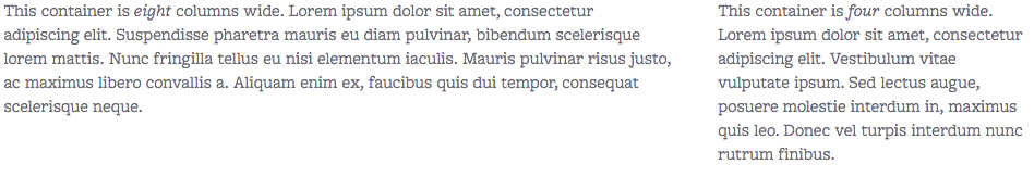 (Screenshot taken from site)
Attributes
The following attributes apply to the [col] shortcode only. The [row] shortcode does not accept any attributes.
| Name | Default | Description |
|---|---|---|
| width | — | Required. The number of columns (up to 12) that the container should span. |
| size | md |
The size of the device screen required to “activate” the column. Below this size, the content will display at full width like normal text. Possible values are xs, sm, md and lg— which correspond (roughly) to phone, tablet, notebook and desktop display, respectfully. |
| push | — | Pushes the container to the right the given number of columns. Used in conjunction with pull (below) to swap the order of columns in a row. |
| pull | — | Pulls the container to the left the given number of columns. Used in conjunction with push (above) to swap the order of columns in a row. |